Beige has long been misunderstood.
Often labeled as simple or safe, it is, in reality, one of the most nuanced and grounding palettes in design. At Pure Salt, beige isn’t a backdrop — it’s a foundation. It carries warmth without heaviness, softness without sweetness, and depth without distraction.
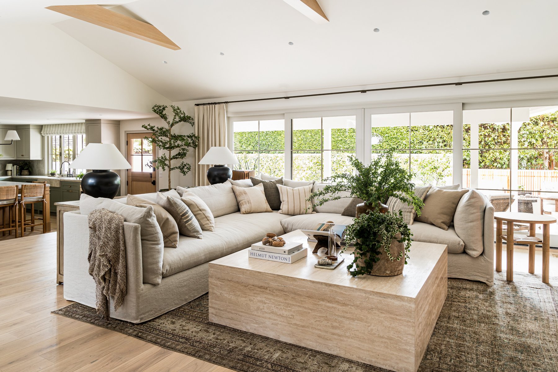
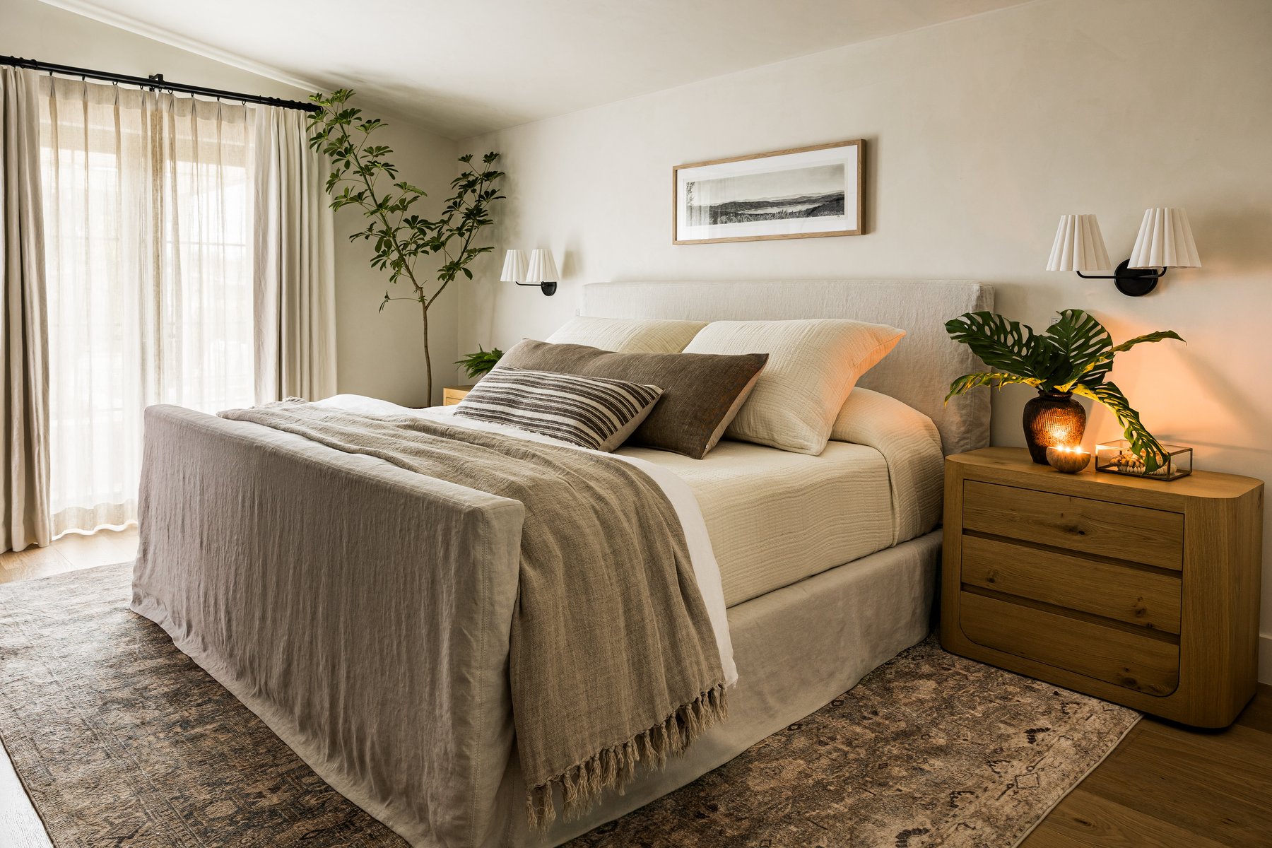
In our design projects, beige shows up in plaster walls warmed by afternoon light, in linen upholstery that invites you to stay a little longer, and in natural woods that anchor a space with quiet strength.
This moodboard is a celebration of beige in all its forms — layered, textural, and beautifully lived in.
Why Beige Works
The beauty of beige lies in its range.
From creamy ivory to sandy taupe, mushroom to warm oat, beige holds subtle shifts in tone that create movement within a restrained palette. It allows materiality to take center stage — linen, oak, travertine, grasscloth, wool — each texture speaking softly but clearly.
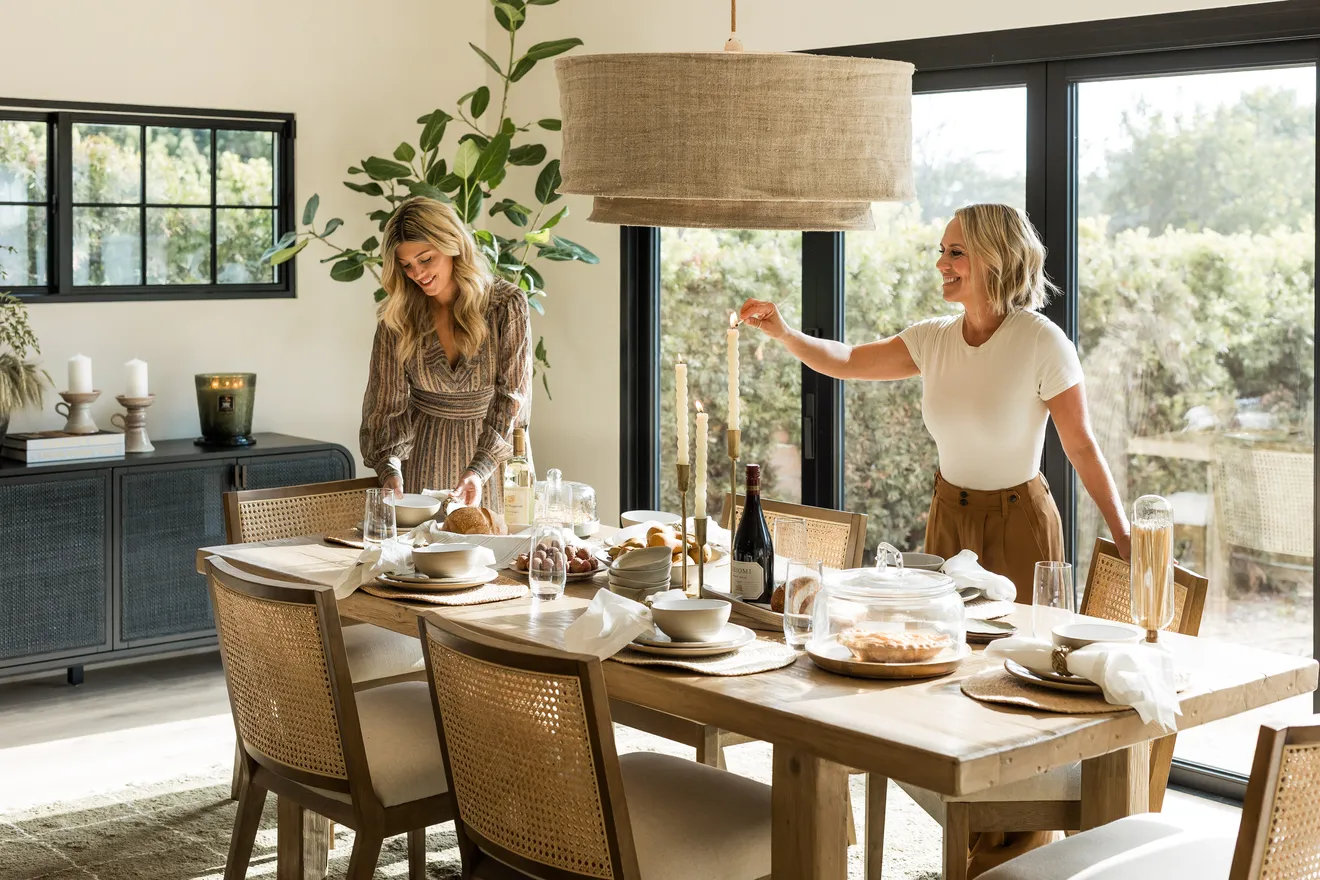
In projects like California Ranch, beige allows the architecture and the light to lead. It invites calm and creates continuity from room to room.
Beige Favorites
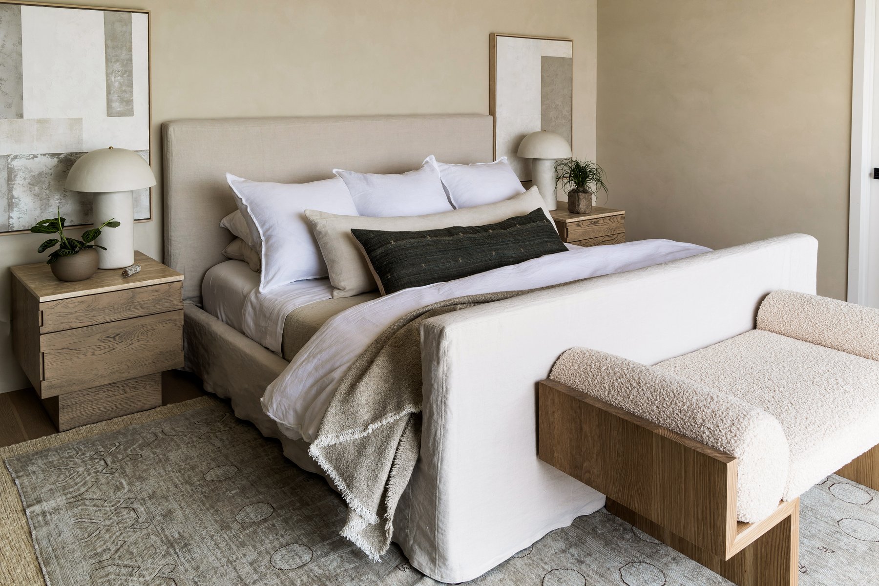
Project Moments in Beige
Throughout our recent homes, beige plays a central role:
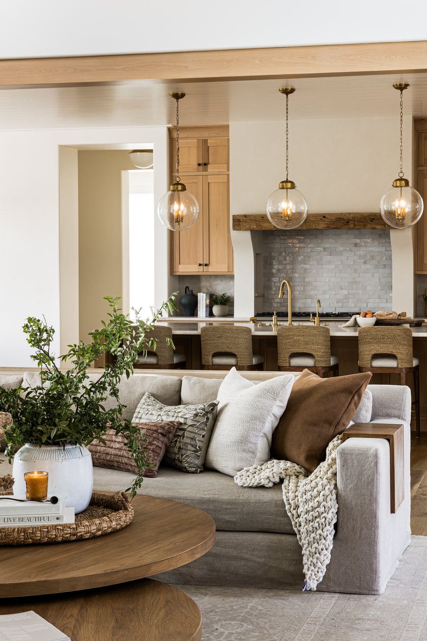
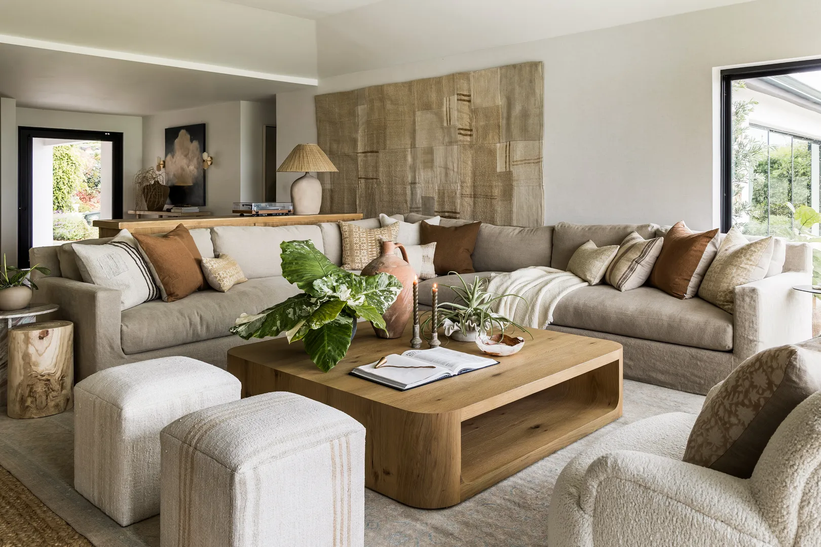
- A living room layered in warm linen upholstery and textured wool rugs
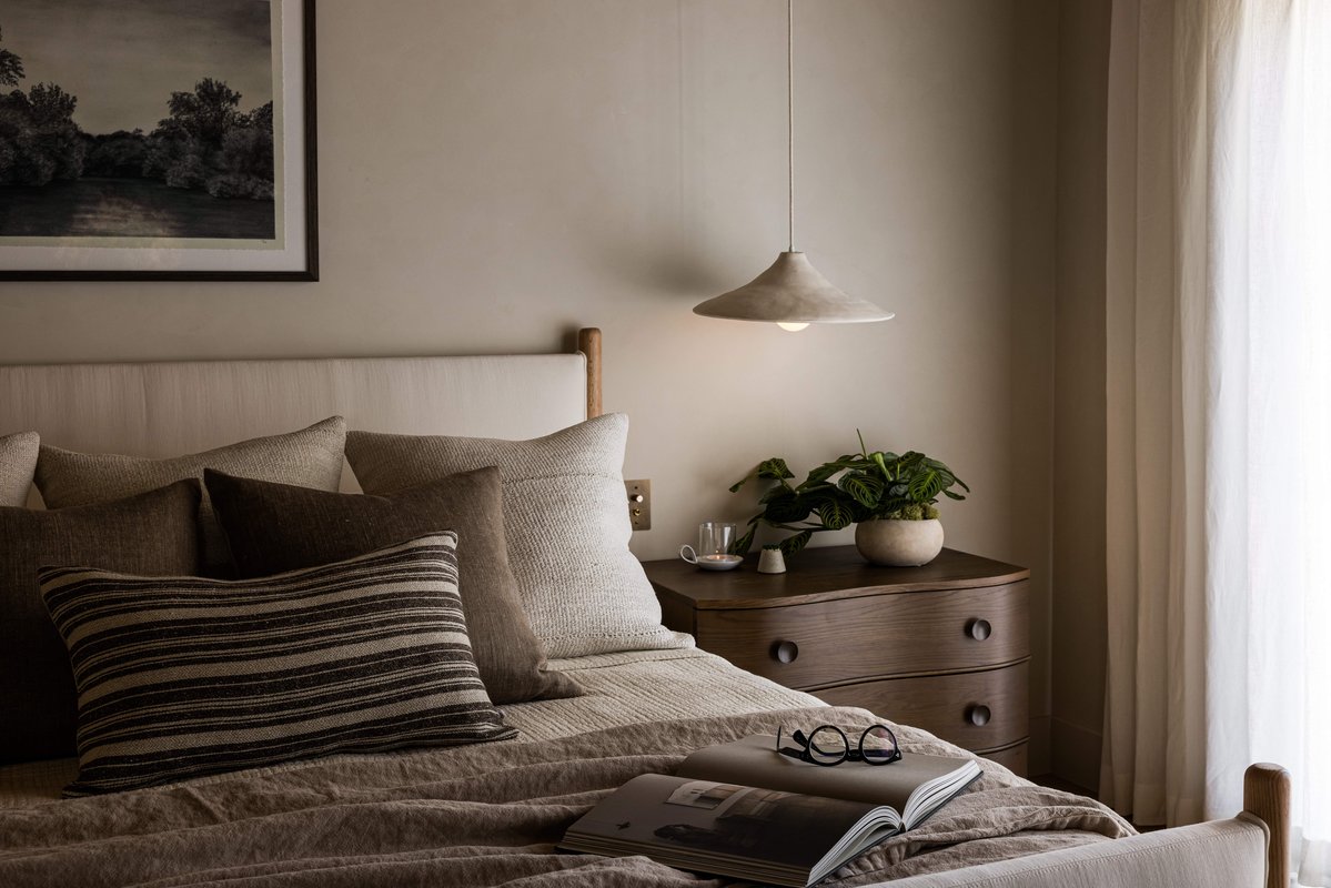
- A bedroom wrapped in soft plaster tones and neutral bedding
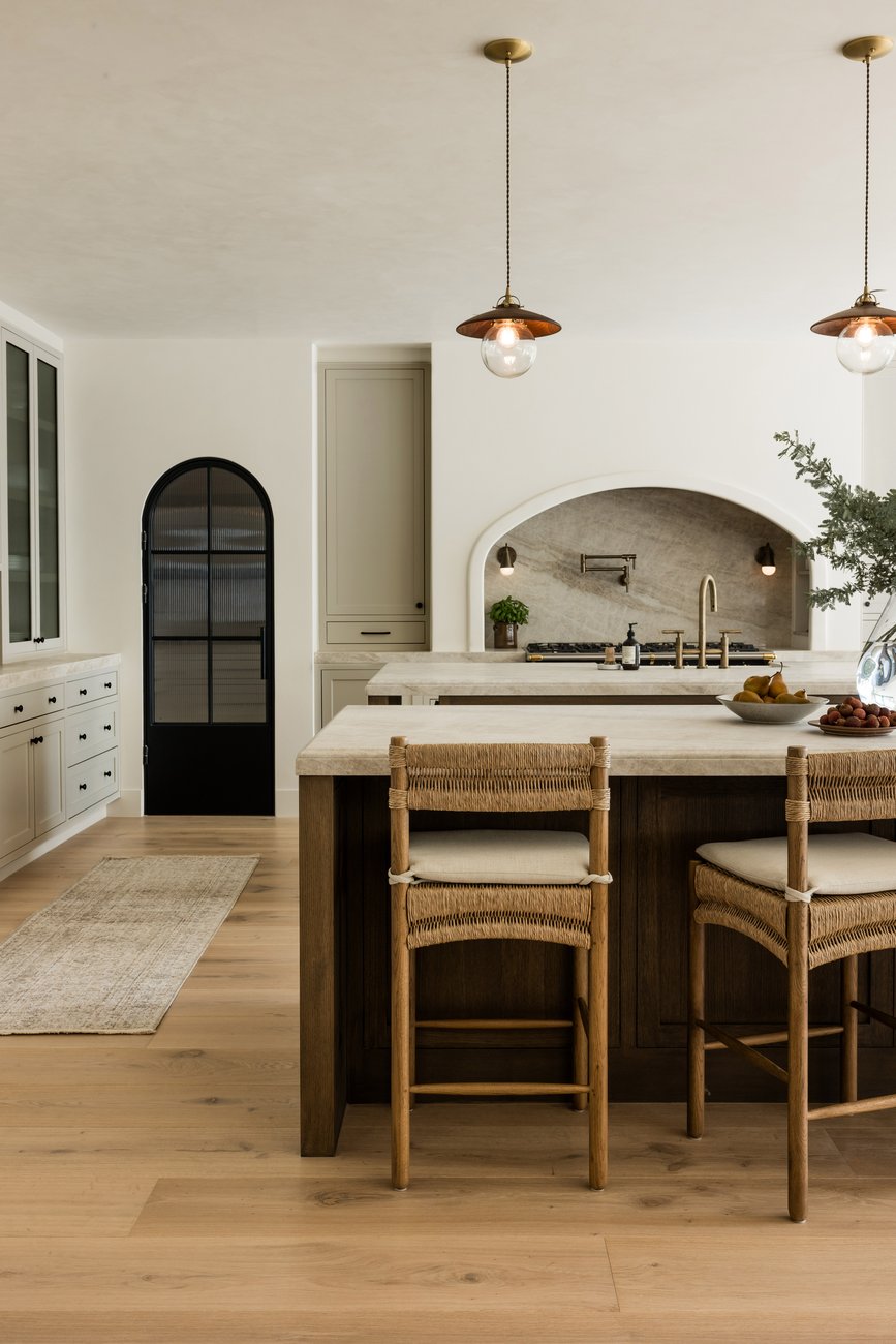
- A kitchen grounded by stone counters and oak cabinetry
- An entry moment defined by a reclaimed console and tonal artwork
Each space feels serene, but never flat. The key is variation — in texture, in finish, in subtle tonal contrast.
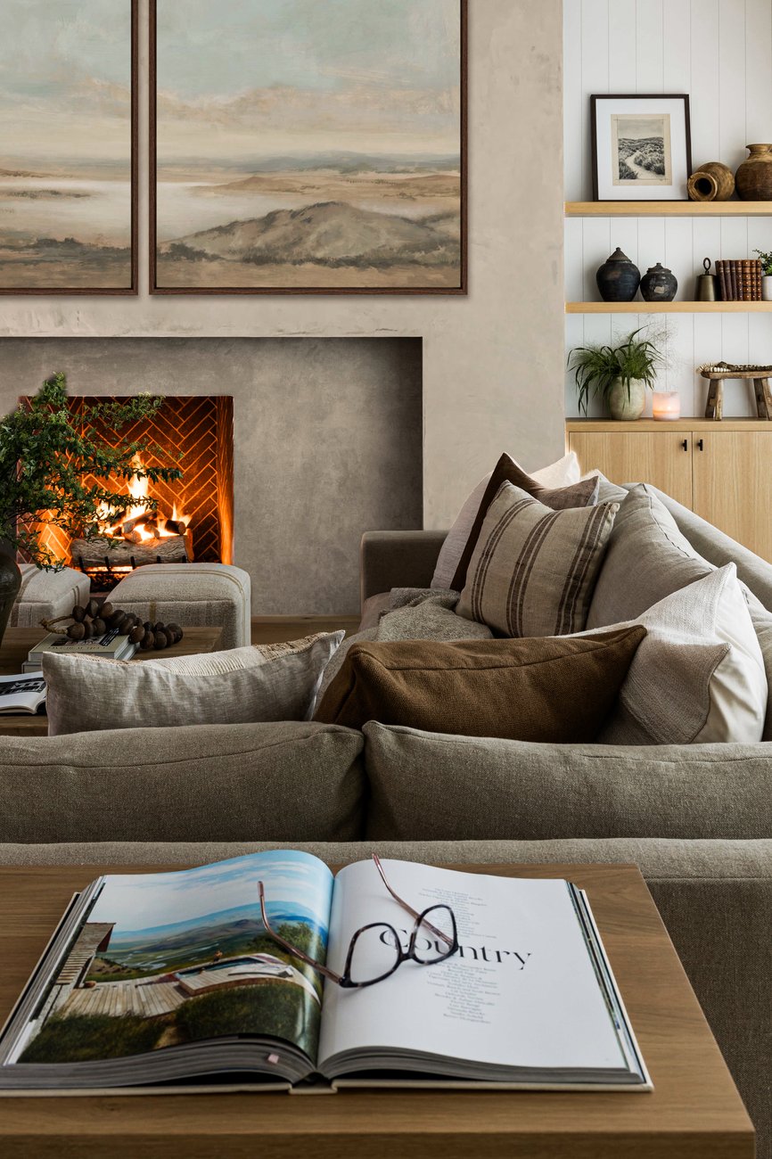
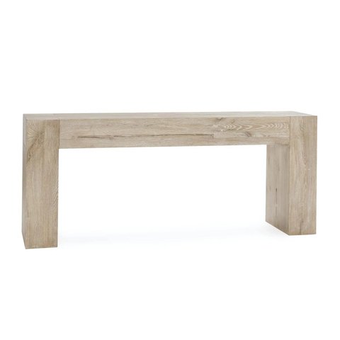
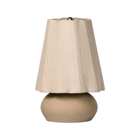
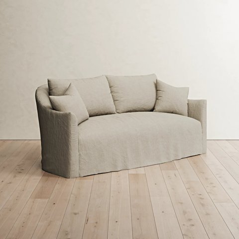
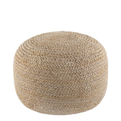
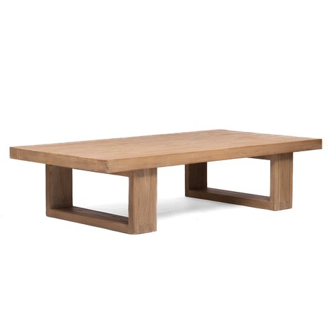
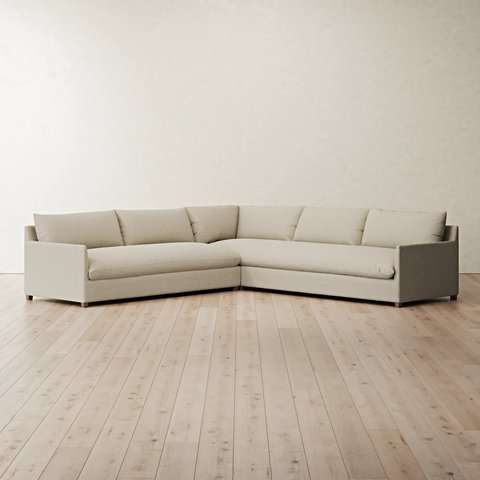
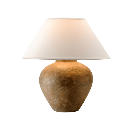
The Beige Foundation: Furniture
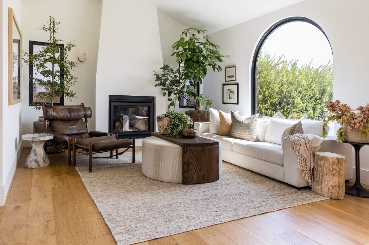
Start with foundational pieces in warm, neutral tones.
A beige sofa in linen or cotton instantly softens a room. A light oak coffee table brings warmth. A textured bench at the foot of the bed adds dimension without introducing color.
Design Tip
Layer multiple shades of beige in one room. Avoid matching everything exactly — tonal variation creates depth.
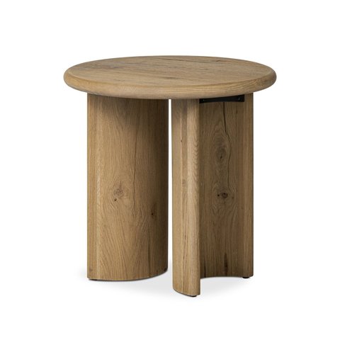
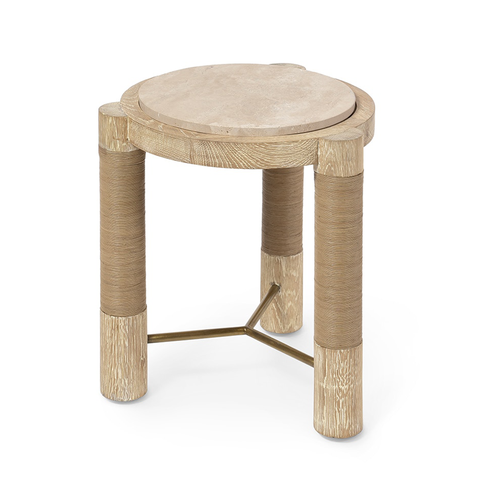
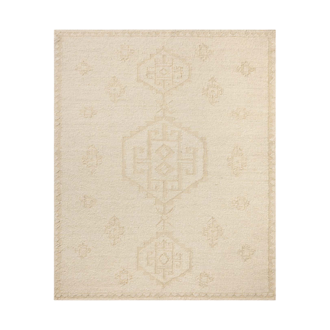
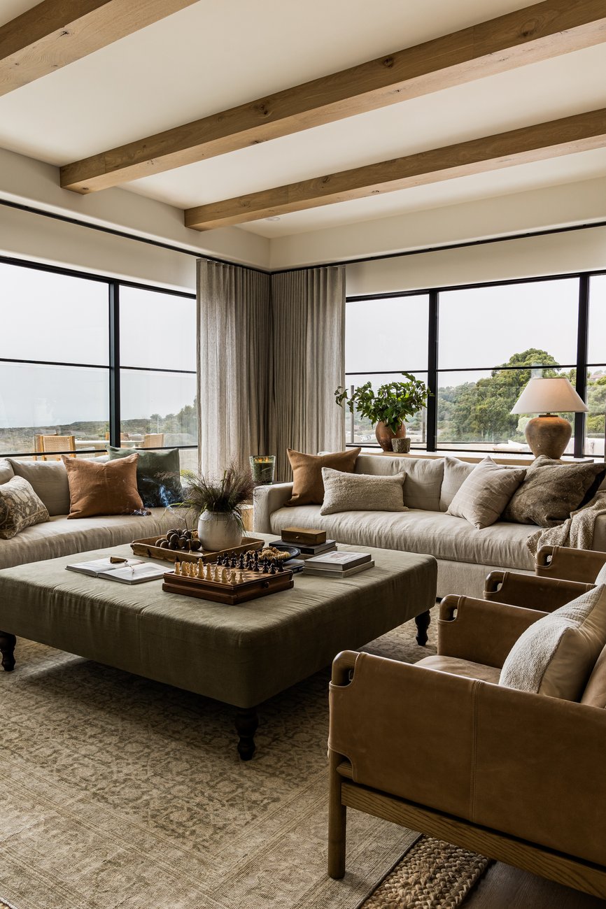
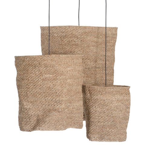
Texture as the Statement
When working within a beige palette, texture becomes the hero.
Grasscloth nightstands. A handwoven rug. A travertine-style side table. Plaster lamps. These elements add visual interest while keeping the overall mood calm and cohesive.
Design Tip
Combine at least three different materials in one vignette — for example, linen, stone, and wood — to keep the space dynamic.
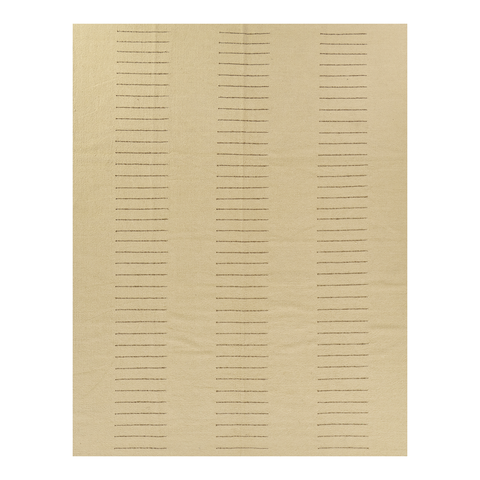
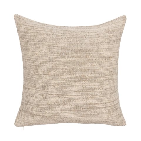
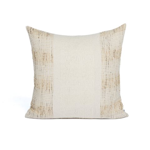
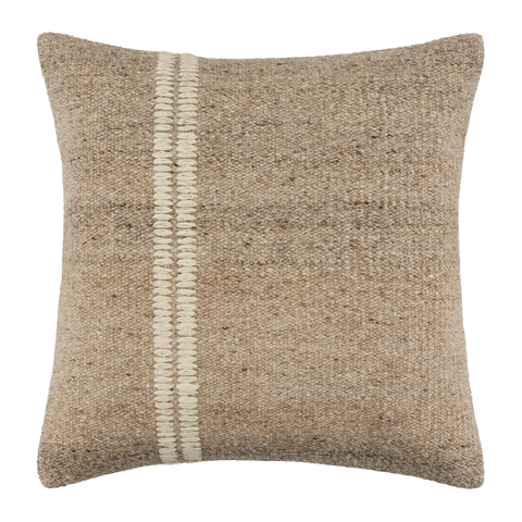
Soft Layers: Pillows & Textiles
Beige doesn’t mean plain. Subtle stripes, tonal florals, and textural knits add movement without overpowering the palette.
Design Tip
Keep patterns restrained in color but varied in scale.
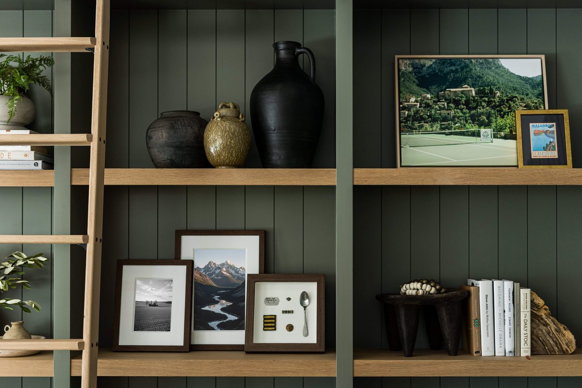
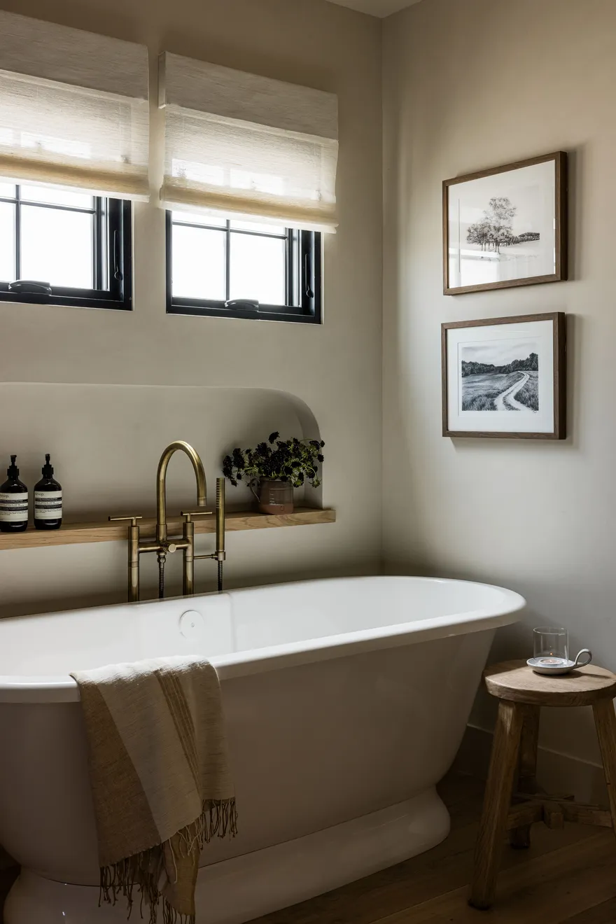
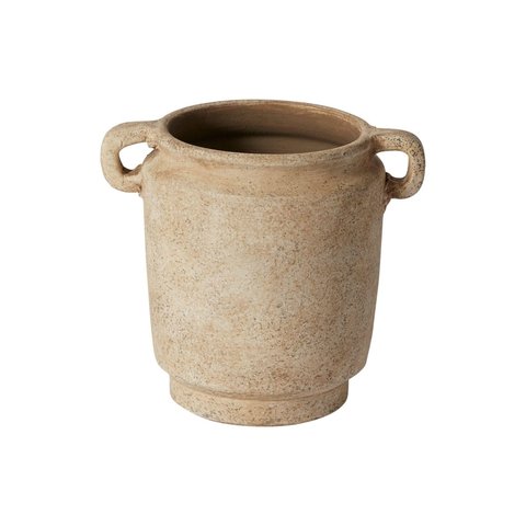
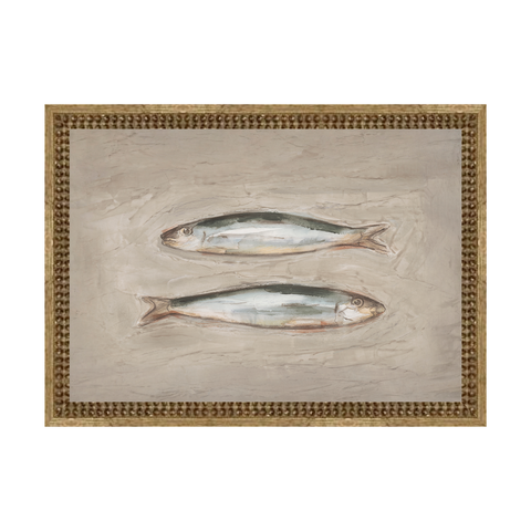
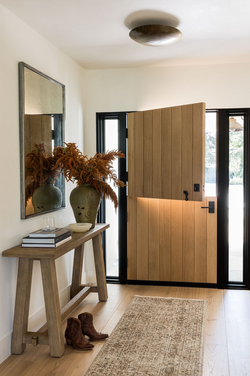
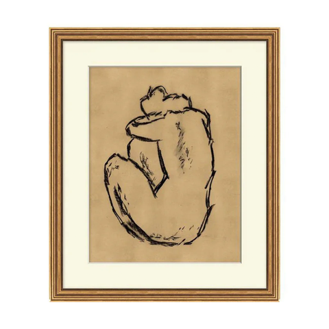
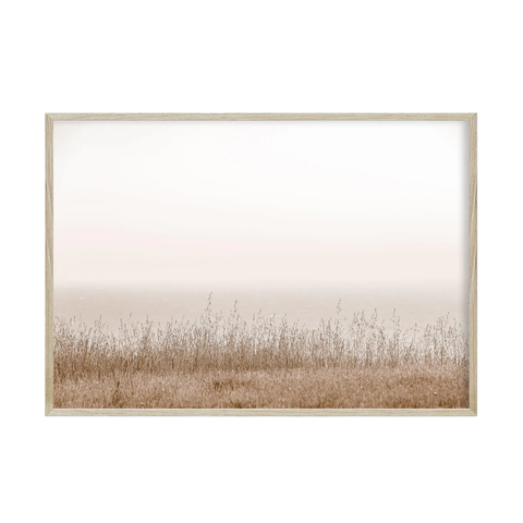
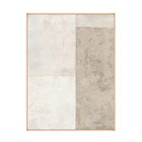
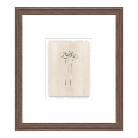
Art & Objects in Warm Neutrals
Beige walls come alive with thoughtfully chosen art and objects.
Mineral-toned abstracts, hazy landscapes, and sculptural vessels bring subtle contrast and character.
Design Tip
Frame beige art in warm wood or antique brass for added richness.
Living with Beige
The power of beige is in how it makes you feel.
It creates a sense of stillness. It softens the noise of everyday life. It allows natural light to shift and change throughout the day, bringing warmth into every corner.
In a world of bold statements and fast trends, beige remains steady — timeless, grounded, and quietly refined.
This is the beauty of beige.